Do you have too much clutter on your website? Would you like to clean it up a bit? Remember that, when people enter your page, they may be looking for a particular thing. They may also be wanting to get a good picture of what you do without reading several lines of text.
Whatever the reason they are there, it helps to make your website stand out by focusing on what is most important. How can you cut through the clutter and focus on the important things? Here are seven examples of minimalist websites that use a minimum of web elements to draw attention to the important aspects of their business and their brand.
Jonas Lindvall
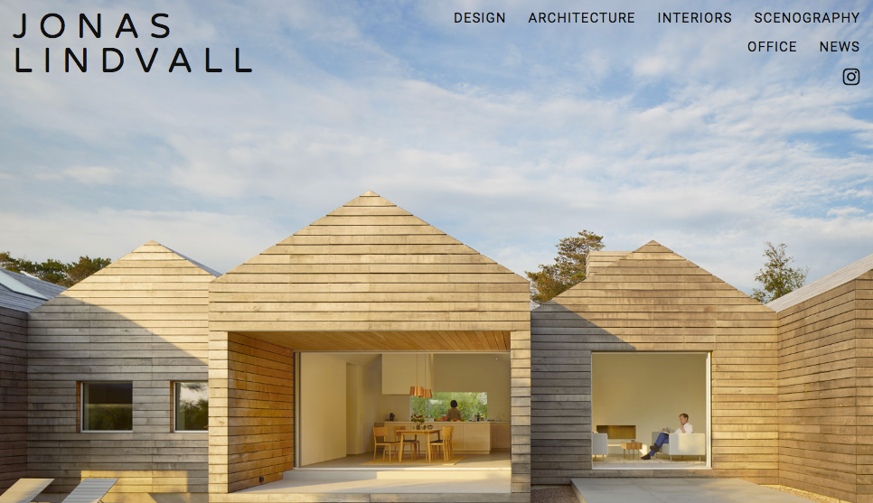
Jonas Lindvall is a well-known architect who is considered a minimalist with his website due to its simple interface. Previously, he had a simple, bright aqua background with a simple navigation on the homepage.
But as of this writing, he had changed this to a nice large photo of a side view of the inside of one of his houses. The navigation is just as simple as it was before except for a few extra navigation items. This is an example of a good use of negative space and creates the idea that it’s okay to have negative space because it forces the eye to the important elements and the purpose of the site.
This technique works for the Jonas Lindvall site because the focus is all on getting the customer to the call to action immediately and to look over the wares without wasting any time on the main page.
Makgoods
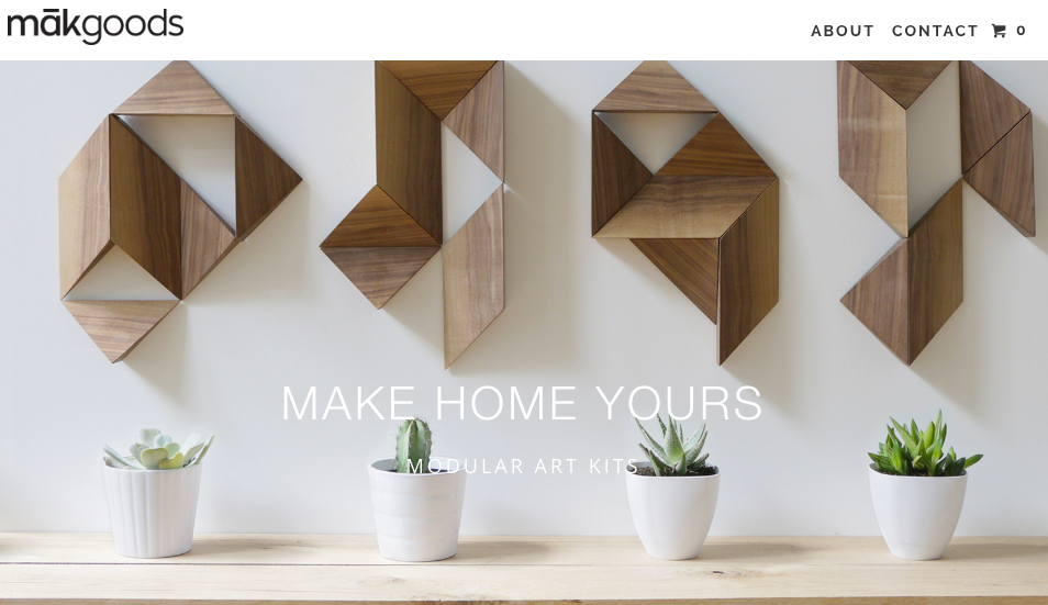
The Makgoods site, another example of minimalism in a website, is a model of good use of photography. Upon entering the site, the user is immediately are drawn to the modular art kits that they are selling on their site.
Again, there is no wasted time and the site is uncluttered. It makes the visitor immediately get down to the business of checking out the merchandise. In fact, the only thing one can do on this site is to either sit and stare and the lovely photography of the art kits or shop for the kits themselves.
This is an excellent example of the minimalist use of space that entices the user to go directly to the online store. After all, there’s not much else to do.
WordPress
WordPress is one of the largest and most influential brands on the internet today. The WordPress CMS powers more than 30% of the sites on the internet, while also having millions of users on their wordpress.com and wordpress.org platforms.
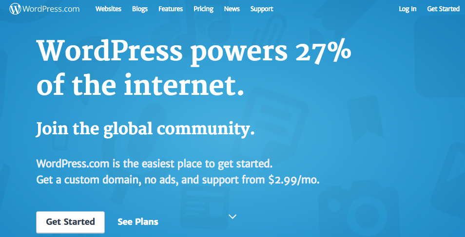
In addition to everything else WordPress has going for them, they’ve also done an amazing job at keeping their site quite minimalistic and targeted right to their audience.
When browsing through their site, you will notice everything goes back to the common goal of getting the end user to create a blogging account. WordPress is not only one of the most successful companies on the internet today, they’ve also accomplished this through their straightforward and minimalist platforms.
Jorge Riera
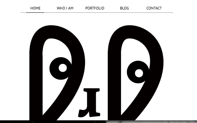
Jorge Riera has a website that illustrates minimalism through contrast. The use of the black and white contrast and artistic angles and designs serves to illustrate the simplicity of a good site through artistic innovation.
Riera is a professional photographer, so the contrast of black and white also reminds people that he does all of his work in black and white as well. You can scroll down or hit the “Portfolio” link to see his portfolio in action.
This gives people interested in Riera’s work a chance to see it quickly when they enter his website. The only other links are “Blog,” “Who I am,” and “Contact.” These are also some of the many benefits to creating a well-defined about me page.
This is a good example of how minimalism can work for an independent artist like Jorge Riera who wants to cut through the clutter and focus on the call to action.
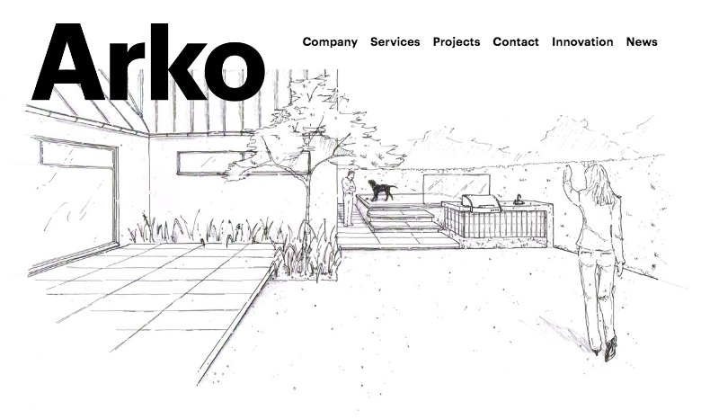
Arko
Arko is an example of simplicity at its finest. It uses sketch art or drawings to create the main part of the website content. Then there are two or three minuscule sections that explain what they do in only a few sentences.
The top navigation is dedicated to their services and projects pages. The services page is a bit wordier than any other part of the website, but it doesn’t waste any words.
It tells of the philosophy of Arko as a professional design firm and explains how they do business.
Their Projects page only lays it out with pictures, and they feature a detailed menu on the far left that allows you see various categories of designs.
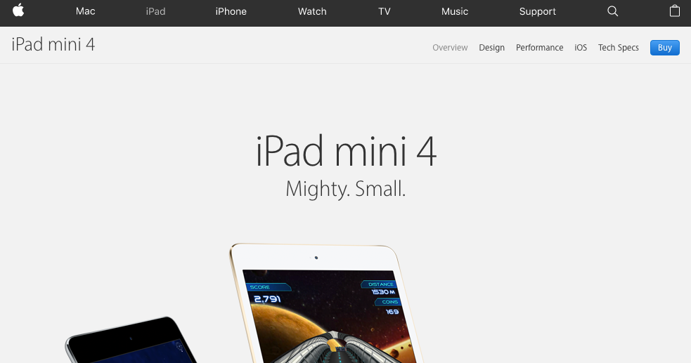
iPad Mini 4
The iPad Mini 4 site is a true example of minimalism. Apple is known for using minimalism in their ads and their website. Steve Jobs and Tim Cook both have approached Apple’s advertising with the idea that “less is more” when it comes to the visual graphics and information that they display with their products.
It seems to work for them, too. The result is a clean-cut design and attractive, simple arrangement that appeals to their target audience and reinforces the high quality that Apple strives for.
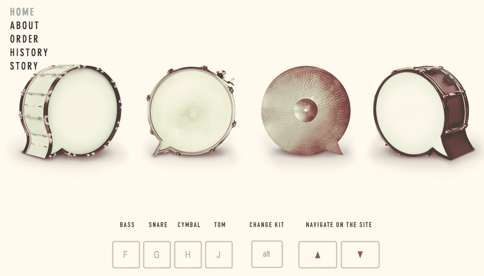
Beatbox Academy
Beatbox Academy is one of the best minimalist sites on the web because it fits perfectly with their brand. When you first enter the site, all you see if a drum.
“A drum, a drum, Macbeth doth come.”
We’re quoting Shakespeare to be witty, but the feeling you get on their main site is almost as full of fanfare as this.
Once you land on their site, there is nothing you can do but wait. There’s not anything to click. It’s like waiting for a show or play to begin. Finally, the virtual curtain opens, and you see four other drums that you are allowed to play and interact with (lots of fun; we tried it!)
It’s a unique experience and focuses on what they do: let you play drums!
There is very little text on the page to complement the self-made concert that you can create by just playing around with the different drums. There’s an extremely brief blurb about what drumming is about and why people do it.
Then it tells you that you can order the complete DVD set if you want to learn.
They cut straight “to the chase, ” and there’s no fooling around.
They just show you what they do, let you experience it on a smaller level, and then tell you to order if you want to know more.
Less is More?
It seems Mother was right when she said, “Less is more.” Most businesses want more on their site than a few images and a paragraph of text. But, if your brand and your purpose focus more on delivering products than elaborating on your brand, this might be the way to go.
Some of these sites seem to use web design as almost an afterthought. When you only use the bare essentials, all that’s left is your brand. The website is just a vehicle to get them there.
Whatever you decide to do, we can help. Web Design Team has been in the business of helping customers create unique site content and web design for over a decade. Whether you need a fully-functional shopping cart, new web design, or a minimalist approach, we can do it all.
Contact us at webdesignteam.com. Because, if you feel that less is more, we can create that for you in a big way.




Leave a Reply