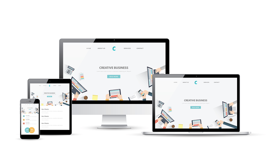
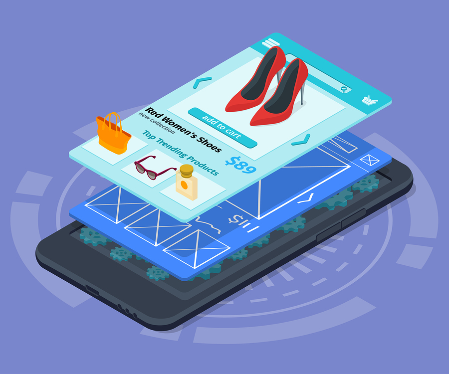
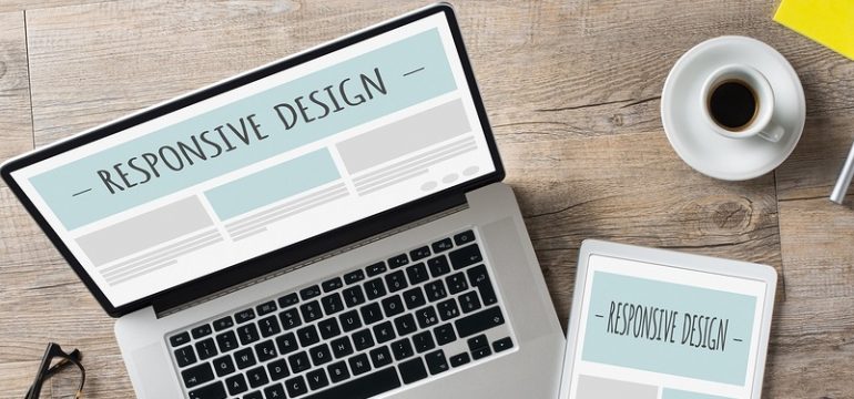
Creating mobile-friendly websites is an important part of your web design. Google requires mobile-friendliness within your websites to maintain and get new views. They penalize websites that are not mobile-friendly by dropping your rankings.
So it is very important to make sure your website is mobile-friendly. But how do you do this? There are some ways that you can increase your web responsiveness on multiple devices and platforms and make your site more mobile-friendly. We have outlined a few of these below. But the main thing is to consider what the goals are with your brand and how you will communicate value to mobile users, and make the platform user-friendly to them as well.

Focus on your navigation
The navigation of your site is an important part of your plan to encourage mobile users to visit your page. If the navigation is set up poorly or people have trouble getting around on your site with mobile devices, they will not want to come back. You need to promote a level of engagement and enjoyment so that mobile users will want to return.
You should create a navigation that lists the most important pages first or at the top if you have a vertical navigation bar. But the best thing you can do to ensure that your navigation will work is to find a web design team that will let you create a mobile-friendly site within your web host.
Creating a Responsive Website
How do you create a responsive website? There are some different factors in creating a responsive web design that will be friendly to mobile users as well as others on multiple different platforms and devices.
Part of the challenge of creating a truly responsive web design is in the fact that it involves coding. Your HTML and CSS code is at the heart of creating responsiveness and adaptability within your site. Some responsiveness can be installed with drag-and-drop by arranging different assets of your page in a specific way that is inducive to accessibility through multiple devices. But some of it must be done within the code.
The Elements of Responsive Design
Responsive web design is composed of some specific aspects, including screen size, platform, and orientation. Image placement is one thing you can work with to improve the responsiveness because this has to do with the way that it looks and the way users tend to behave within the framework of your site.
The platform that the users are coming in on is also important and the web server on which you house the site will help determine whether your site is considered responsive or not. This is a difficult task to make your site responsive to all platforms and devices because you have no way of knowing what they are using when they come to your site.
The potential loss of visitors due to this fact is a problem for many web owners, and it becomes critical that you plan accordingly so that your site becomes accessible, no matter what they come in on.

The WordPress Element
A lot of people like to use WordPress for their website. This is understandable because it is a simple platform to use even for the most basic user. But, despite the many advantages to the simple WordPress platform, it has a few disadvantages. One of them is that it is limited to the template that you are using within the WordPress platform.
This is why you need a professional dedicated web design team to create a mobile-friendly site that is responsive.
What does a web design team do?
A professional web design team has a lot of skills. They know how to create a compelling site that people connect to and appreciate. They know how to construct it from both an engineering perspective and a creative approach.
The key to finding the best web design team is to think about what your goals are for your business and find a web design team that will have the insight to create a website that is friendly to your mobile users as well as the responsive design that you need to include in order to keep your mobile users engaged.
If you need a professional design team, look no further than webdesignteam.com.
With several years of experience with superior web design, we look at every project as something unique, and we create customizable web sites that are both mobile-friendly and responsive. We know how to create a custom web design that fits the needs of our customers and focuses on creating a strong base for you to build your brand around online.
Tips for Responsive Web Design
HTML Goodies, a site well-known for tips on creating websites that are responsive, has a list of tips on their site to help web designers with their responsive web design.
1. Planning– One thing to always keep in mind is to plan before producing your work. A good web design firm knows and understands this. You have to sketch out the results that you wish to achieve and prepare a way to success so that you will know when you are on the right track.
2. Engineering software– Using engineering software, a web design firm knows how to utilize the best aspects of technology to create the perfect site. So the key to achieving this is to focus on getting the best design firm.
3. Responsive Design– Responsive design can be achieved through a variety of techniques that will help you achieve your goals through your website.
4. Focus on Navigation– Navigation is important within your design because it makes your site more usable and accessible, no matter what type of device users come in on.
You can check out the site for more tips. They have other ideas as to how you can achieve UX (user-friendly) capabilities and communicate value to your mobile users. Also be sure to check out our HTML 5 guide and resources as well.
How Web Design Team Can Help
At webdesignteam.com, we can meet all of these criteria and more. We are expert designers with years of experience. We know how to create a responsive website that is creative and meets the needs of your business.
We also offer infographic design, 2D and 3D animation, and many other extra services that will complement our web design and make your site more user-friendly and responsive.
Visit us at WebDesignTeam.com, and we’ll get started on your website right away.
The first step is to get started.


Leave a Reply